graphic design work
Design work ranging in print/publication, branding, font design, UI/UX, product design, advertisement/social media, and everything in between.
Featured here is a collection of my works for Obermeyer. Ranging from marketing assets such as social media & print advertisements, emails, UI/UX design, to other design work such as logos, print goods such as catalogs, magazines, tags/packaging, and more.

Obermeyer Meta Advertisements
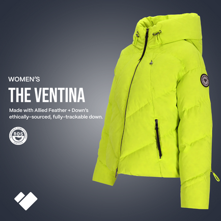
This collection showcases social media advertisements I designed for Obermeyer, optimized specifically for Meta platforms. The first four ads were created to launch our Off Grid collection, a pivotal brand shift celebrated with bold visuals and storytelling to engage our audience. The final piece highlights one of our many studio ads, leveraging ghost mannequin photography to showcase product details with precision.
These campaigns play a critical role in driving significant traffic and sales to Obermeyer's DTC website while simultaneously boosting visibility and engagement on our organic social channels, helping to grow a dedicated community around the brand.
Obermeyer Plantable Thank You Card Redesign
I was tasked with completely redesigning Obermeyer’s thank you card, included with every DTC order. Thinking outside the box, we aligned the design with Obermeyer’s longstanding commitment to giving back to the planet. The result? A plantable thank you card—not just recyclable or compostable, but one that blossoms into wildflowers when placed in soil and watered.
To mimic the feel of a traditional thank you card, I chose a bi-fold design:
-
Cover: A vintage photograph of our founder, Klaus Obermeyer, evoking nostalgia and heritage.
-
Inside: A thoughtful note from Klaus, planting instructions, and a nod to Obermeyer’s values.
-
Back: Practical details, including return instructions.
To tie it all together, I transformed the Obermeyer “mountain heart” logo into a flower—a fitting symbol for what this card represents: gratitude for you and Mother Earth.
Obermeyer Email Campaigns
Working alongside our Director of UI/UX, I designed engaging email campaigns for Obermeyer’s DTC audience, aligning visuals with broader marketing strategies. Featured here is a Back-to-School campaign highlighting our Kids and Teens collections.
Email marketing consistently stood out as one of our most successful channels, with each email generating $20,000–$50,000 in revenue. During peak seasons, we maintained a strategic cadence of 2.5 emails per week, effectively driving both sales and brand engagement.
Obermeyer Social Media Advertisements – Meta Campaigns
For 23/24 I redesigned the hang tags that go on all Obermeyer products. To cut down waste, cost, and to be overall more environmentally friendly, we overhauled the once large, bulky, and multiple page hangtags and slimmed in down to be as minimal, yet as effective as possible. Now customers just have to scan the QR code to find information about their product, with the necessary information such as waterproofness and breathability still at an easy glance. With over 500,000 of these tags made just in the first season, I received nothing but praise from reps and dealers alike on the new redesign. I'd call it a success!
Also – a little bonus at the end, one of Obermeyer's factories, Ethical Apparel Africa, located in Ghana, liked our new tags so much they asked me to design a hangtag for them as well!
Obermeyer Hang Tag Redesign – 23/24 Season
For the 23/24 season, I led a complete redesign of Obermeyer's product hang tags, prioritizing sustainability, cost efficiency, and a cleaner customer experience. The previous tags were large, bulky, and multi-paged, so I streamlined them into a minimal yet highly effective design. Key product details, such as waterproofness and breathability, remain easily visible, while a QR code now connects customers to additional product information online.
With over 500,000 tags produced in the first season, the redesign received widespread praise from reps and dealers for its innovation and efficiency.
Bonus: One of Obermeyer’s partner factories, Ethical Apparel Africa in Ghana, loved the new tags so much they commissioned me to design a hang tag for them as well!
Obermeyer Annual Catalog Redesign
Each year, I design Obermeyer’s annual catalog from cover to cover, and for this project, I spearheaded a complete overhaul with a focus on sustainability and efficiency. Previously, the catalog existed as two separate, bulky books—one for kids and one for adults—totaling over 300 pages. I streamlined the design into a single, cohesive catalog of under 100 pages, retaining all essential product details while prioritizing clarity, style, and functionality.
This new, environmentally conscious format significantly reduces paper waste and costs, aligning with Obermeyer’s sustainability goals. The redesign has since become the gold standard for Obermeyer’s B2B catalog and serves as a versatile template for future seasons, ensuring efficiency for years to come.
Print Magazine Advertisements
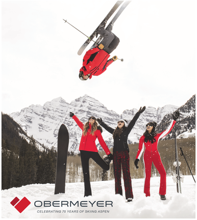
This selection showcases a range of print advertisements I designed over the past year, spanning regional magazines to national publications. Each ad was crafted to align with the publication’s audience while maintaining Obermeyer’s distinct brand identity, combining compelling visuals and messaging to drive engagement and awareness.
Luxury Sunglass Packaging for The Little Nell
To highlight Obermeyer’s high-end appeal, I developed an exclusive packaging design for our sunglasses sold at The Little Nell, Aspen’s most premier luxury hotel. The goal was clear: create packaging that embodies sophistication and screams luxury.
After extensive prototyping and countless iterations, we landed on a design that delivers an elevated unboxing experience, perfectly aligning with the upscale nature of both the product and the iconic location.
Obermeyer ReLove – Logo Design & Project Lead
Featured here is the logo I designed for Obermeyer’s new peer-to-peer resale platform, ReLove, including various color variations. As a nod to Obermeyer’s rich heritage and the platform’s focus on vintage gear, I incorporated the brand’s original ski pole heart logo into the design.
Beyond the logo, I spearheaded and managed this project from conception, collaborating closely with industry leader Trove to bring the platform to life.
ReLove was launched as a sustainable solution for:
-
Allowing consumers to trade in and purchase used gear at discounted rates.
-
Highlighting and selling vintage Obermeyer pieces, now highly eclectic and sought after.
-
Offering deeply discounted samples and returns, making outdoor gear more accessible while reducing waste.
This platform reflects Obermeyer’s commitment to sustainability, affordability, and honoring its iconic legacy.
UI/UX Design at Obermeyer
My UI/UX work at Obermeyer spanned multiple platforms and projects, enhancing both customer-facing and B2B experiences:
-
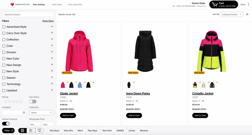
Mailing List & Loyalty Program Pop-Up: Designed a seamless sign-up page and pop-up on our old Drupal site to drive email subscriptions and loyalty program enrollment.
-
Elastic B2B Platform: Built and populated Obermeyer’s Elastic Suite site, streamlining the wholesale ordering experience.
-
Shopify Development: Collaborated closely with our Director of UI/UX to master Shopify’s backend, troubleshoot issues, and optimize the platform. Projects included:
-
Developing and implementing the “Shop the Look” feature for better product discovery.
-
Designing and populating the Product Features section to enhance usability and product storytelling.
-
These projects contributed to a smoother user experience and improved functionality, aligning Obermeyer’s digital presence with its premium brand identity.
Miscellaneous Design Projects
This collection highlights a variety of projects I’ve designed at Obermeyer, showcasing versatility across mediums and purposes:
-
Thank You Cards: Thoughtfully designed cards included in every order to elevate the unboxing experience and strengthen customer connection.
-
Social Media Advertisements: Engaging visuals tailored to drive traffic, boost sales, and amplify brand awareness.
-
Seasonal Designs: Custom Christmas cards and posters that celebrate the Obermeyer community while maintaining the brand’s visual identity.
-
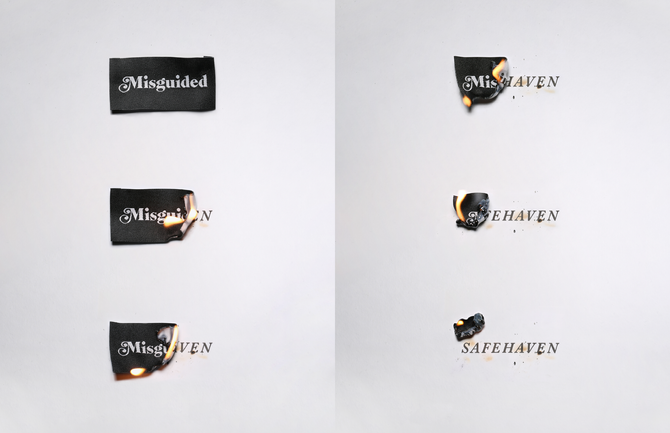
Logos & Branding: Unique, purpose-driven logo designs for special projects and initiatives.
Each piece reflects a blend of creativity, strategy, and attention to detail to meet diverse goals while staying true to the Obermeyer brand.
I was commissioned as the lead designer for Casual Fridays Issue 02, a 96-page publication celebrating independent designers and artists from around the world. Collaborating closely with the editor, I developed a unique and cohesive layout that highlights each contributor's work while maintaining a visually engaging flow throughout the magazine.
This project allowed me to blend thoughtful design with storytelling, creating a publication that feels both curated and contemporary, showcasing creativity on a global scale.
As the lead designer for Casual Fridays Issue 03, I conceptualized and designed this 110-page publication from the ground up. Working collaboratively with the editor and copywriters, I brought to life a dynamic layout that highlights brands, artists, and creatives from around the globe.
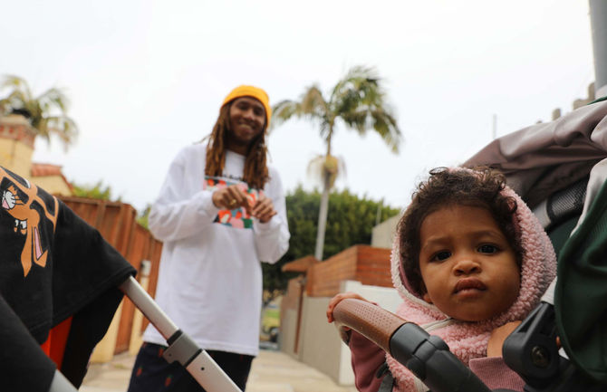
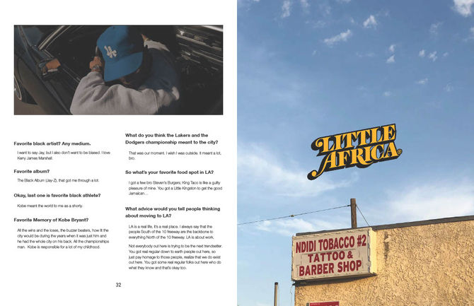
The centerpiece of this issue features Anwar Carrots, the LA-based designer and founder of the iconic streetwear brand Carrots. The design reflects the energy and individuality of the contributors, balancing bold visuals with clean, engaging storytelling.
As the lead designer for "The Black Issue", Volume 01 of Casual Fridays' annual series, I had the honor of designing this 100-page publication from the ground up. Created to celebrate the spirit and creativity of Black designers, brands, and artists worldwide, this magazine reflects the identity and mission of Casual Fridays as a Black-owned business.
Collaborating closely with the editor and copywriters, I crafted a visually striking and cohesive design that amplifies the voices and work of the featured creatives, making this inaugural volume a powerful and meaningful addition to the series.

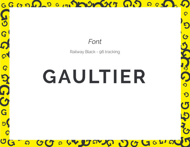
For this school project, I was tasked with rebranding a major company or brand, and I selected Jean Paul Gaultier. The rebrand explores a modernized identity while honoring the iconic spirit of Gaultier’s legacy.
The work showcased includes:
-
Initial Rebranding Presentation – Outlining the vision, strategy, and creative direction behind the rebrand.
-
Brand Style Guide Manual – A comprehensive guide defining the new logo, typography, color palette, and visual identity system.
-
Event Deliverables – Custom collateral designed for the Gaultier SS17 Fashion Show, including posters, invitations, and digital assets to align with the refreshed brand identity.
This project reflects my ability to develop and execute a cohesive rebrand, blending creativity, strategy, and attention to detail.

I designed a series of social media posts for High Fashion Talk to promote the launch of their newest zine. The publication features exclusive articles and interviews with some of the most influential figures in fashion, including Kim Jones, Michèle Lamy, Gate, Maison Martin Margiela, and more.
The goal was to create visually compelling and shareable content that captured the essence of the publication while generating excitement and engagement across platforms.

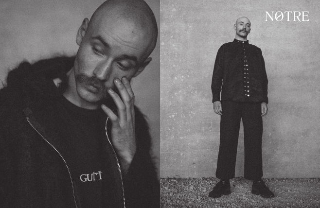
For my Publication Design class, I created a magazine entirely from scratch, focusing on local creatives in Chicago and highlighting the work of friends within my creative community. This project allowed me to explore editorial design, typography, and layout while telling authentic stories that celebrate Chicago's vibrant artistic scene.
From concept to execution, I developed a cohesive visual identity that reflects the energy and individuality of the featured artists, balancing engaging imagery with thoughtful design.

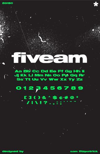
In my Experimental Typography class, I created a thick, bold, sans-serif font with a strong, modern aesthetic. The project includes the full font display, a type specimen poster showcasing its versatility, and a double-sided note card highlighting practical applications.
This project allowed me to explore type creation from concept to execution, blending creativity with functional design.

For my Experimental Typography class, I designed a magazine layout featuring my favorite graphic designer, Peter Saville. The layout explores Saville’s iconic work and influence, blending thoughtful typography, dynamic composition, and clean visuals to reflect his groundbreaking design style.

At the start of the pandemic, I was commissioned by Spouting Rock Beach Association, my former employer, to design a curbside pickup menu. With the Club lacking a defined brand style, I drew inspiration from its coastal environment, incorporating an ocean blue trim and a layout that conveys a high-end, luxury feel. The result was a polished, functional menu that seamlessly aligned with the Club's atmosphere.

This collection showcases event posters I was commissioned to create for various occasions, including art shows, parties, and pop-up shops. Each design reflects the unique vibe of the event, blending bold visuals and typography to capture attention and set the tone for the experience.


